elements

You are currently browsing articles tagged elements.

Status tags revisited

Status tags are my preferred approach to visually attaching state metadata to work items.

In plain english, what this means is that if you have a task, represented for example by a standard size Post-it, you would add a physical tag, represented by a smaller colored Post-it, to indicate it has some particular status, such as “Blocked” or “Delegated” or “Bug” or “Please Test”. This creates visibility and awareness and enables the right people to react to that new status fast.

A visual alternative to tagging is creating special columns or specially designated areas in your taskboard that fulfill the same purpose.

While this is valid, and many people do it, I much prefer tagging to that approach. Taskboard real estate is expensive. If you start creating special areas or columns for each status a piece of work can have, you might quickly fill your Taskboard with empty zones. Furthermore, changing the structure of your taskboard is cumbersome. This might limit the number of status areas you create. Too many areas and columns make people think about waterfall processes, even if they are not meant to be used. For example, look at the picture of the following kanban board:

While it looks good because it was done with care, there is much wasted space in those columns and boxes. And let’s take a closer look at those separate areas at the right. In this example we see a “Back to business” box. What if this status is very temporary? In that case, you are probably better off tagging it. Creating the box has allowed work to accumulate there, unchecked. Are all those post-its supposed to be going back to the main board? Someone is going to be spending some serious time moving post-its back and forth…

Another example: let’s assume a task that involves coding but is functionally testeable is being developed. During the same day the following happens:

  • A developer starts and finishes it
  • Someone else tests it and finds a bug
  • The original developer fixes the bug
  • The task is re-tested and this time declared “done”.

This is a typical scenario in Agile teams. If you have separate columns for “In development”, “To validate”, “Defect found”, you are going to spend the whole day moving the task around columns. People might lose track of where the task went (well, not really – but it does require more effort to locate it). I prefer the much simpler solution of leaving the task in place and rotating status tags on top of it. Another advantage: if it would go through this code-test-bug-fix cycle many times, you can place status tags on top of others, creating a “traceability” effect. With columns, you can’t do that.

Tagging is very flexible. There is no limit to the number of tags you can create. Some teams create temporary tags for special occasions. In the example above, the tag “checked” was created specifically for the occasion. This can be done quickly and easily by the team by their own initiative. Almost no work is required and suddenly your visual management process includes a new status.

I think the elegance, flexibility and visual appeal of using colored tags for indicating task status cannot be denied. Even in a software tool, it looks good, as the example below shows.

For physical taskboards, my preferred tags are Post-it 653 which come in many different colors. They are the 1.5″x 2″ small ones.

Important detail: if you just stick this small post-it onto a bigger one, it will not stick, it will fall off almost instantly. That’s why I use a small piece of Scotch Magic tape with each status tag. See the first picture in this post for a detail.

Scrum of Scrums detailIn Scrum, the “Scrum of Scrums” is a way to ensure alignment and coordination across different teams, or among different sub-teams of a large Team.

How big is the Team?

A Team is a group of people collaborating towards a common goal. Sometimes it’s not that easy to pick your goal, and thus figure out who the Team is, or who it should be. On one hand, small teams are good. Small is simple, small is beautiful.  So maybe you should pick a small goal, and make a small Team.

On the other hand, you should try to look at the system as a whole. This could mean anything: a project, a department, the whole company… What is the ultimate system, but the Organization itself? Your whole company is the Team, from the Systems Thinking perspective. Especially for small companies. So maybe you should think of a large Team.

Most likely, we need to strike a balance between these two dichotomic approaches.

I have found my comfort zone with a simple, practical definition: One Team, One Backlog.

Splitting it up

Banana SplitLet’s assume you found your definition of Team, and you have more than ten people in it.  Since the ideal team size is 5 to 9, you probably want to split them up. But you don’t want to lose the concept of  one Team. The recommended approach is to break them up into sub-teams. I will discuss some ideas for creating these sub-teams and for visualizing their work, while trying to keep and respect the spirit and vision of the one (big) Team.

Feature teams

Using the same logic regarding why it is interesting for team members to be as cross-functional as possible, the best strategy for making sub-teams is to create cross-functional feature teams, as opposed to ‘component’ teams or -god forbid- teams that specialize in a certain technology or skill (like  ‘QA team’ or ‘.Net team’).

Feature teams are teams that work on features, i.e. stories. Pieces of business value. They are value-driven teams, whereas other sub-team splitting strategies (component, skill, etc) create function-driven teams that invariably fail to deliver business value and create local optimizations and waste.

You create your feature teams by spreading out the knowledge, skills and experience equally. The goal is that any team can do any story in the backlog.  You should stress that the “real” Team is the big one. Sub-teams are just created for communication and coordination purposes. In my opinion, they should not develop too strong a team identity. For example, I would not measure sub-team velocity, and I would make sure people rotate from sub-team to sub-team a lot.

You can then work with a single, large backlog and distribute stories in round-robin fashion.

Colored teams

I like to give sub-teams a color for a name. E.g “Red team”, “Blue team”, etc.  Colors are very visual and we will be able to use this to our advantage. For example I use electric tape of the same color to create their taskboard, which gives them an immediate strong visual identity (see picture below). Another reason colors are good is that they are non-hierarchical, and people don’t attach themselves that much to a color.

colored_boards_small

The Black team

In large projects, particularly in transitioning organizations, there are always some people left floating around that are not doing any actual work at team/trenches level.  I put them in the Black team. This is a pseudo-management team that mostly combines the responsibilities of Product Owner and Scrum Master (in the same team, not the same person!) and any other role that you either want to share across teams or that you simply can’t get rid of.

Typical examples of people who we have put in the Black team include:

  • all the ex-Project Managers, who now had to remove impediments full-time (they also had a lot of administrative work to do: fake Gantt charts, fill in timesheets, useless reports, etc)
  • the Agile Coach
  • the Product Owner(s)
  • an Architect from Architecture (we later convinced him to move into the trenches with the real teams)
  • a QA Team Lead who didn’t want to test (we later got rid of him, once the testers he used to C&C were doing agile testing)
  • a Release Coordinator, whose job was to beg to Infrastructure to deploy our app into production (this was a full time job)
  • etc.

As you can see these were mostly roles that existed because we were doing Scrum within a traditional large organization. In any case, the idea is to group all these people into one “team” so as to not leave any loose ends. Ideally they will jell and work cooperatively, otherwise at least you can visualize their work by putting up a taskboard for them. For example on this picture below, most tasks are either impediments or things that have to be delegated to people outside of the Team. The horizontal lines are not stories but simply priority slots, i.e. High Priority, Medium and Low. If I would have known at the time, I would have put WIP limits, because nothing was ever getting done here. :D

Scrum Black Team

The Scrum of Scrums

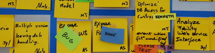
Ok, let’s move on to the interesting part. Each sub-team has their scrumboard with the stories they have selected for the current Sprint, divided into tasks as usual. How do we visualize what is going on at Big Team level? How do we keep track of so much work? We need to change the level of granularity. In the Scrum of Scrums, you only visualize stories. You create the “Scrum of Scrums storyboard” where every story that is currently open is visualized, with the team that has it and the current status indicated. The picture below shows such a board at the beginning of a Sprint. Click on the picture for a larger version. Note: This is actually the same physical whiteboard as pictured above… you are just looking at the other side! The Scrum of Scrums side is pointing towards the hallway, so passer-bys can look at it.

Scrumboard Scrum of Scrums 1

There are only two columns: “Story” and “Status”. Story has a copy of the story card that is on the team board. Status is normally “not started, “in progress”,  “done” or “done-done” (a curious distinction between “we think we’re done” and “we’re sure we’re done”). This last done-done was indicated with a red star. Each story has a little magnet indicating which team is working on it, but we also experimented with other visual elements like creating status tags of the color of the team. In this example you see both at the same time: a Green Team story will have a green “in progress” tag, and also a green magnet.

The mechanics for the Scrum of Scrums are simple: after the daily Scrums, each team sends a rotating delegate to give a brief status report on each of their open stories to the other delegates and the Product Owner. The delegate is then responsible for updating the rest of his sub-team members on what’s going on at project level (something that never happens, but oh well). Of course sometimes a lot more people show up during the Scrum of Scrums. Anybody who is interested in knowing what’s going on at Big Team level goes.

Note: The black and blue tape indicate nothing in this case, we simply didn’t have enough tape of the same color, and our boss was a fan of Club Brugge (whose colors are black & blue), so we made it for him.

This is how the board might look like towards the end of the Sprint, on a good Sprint where lots of stuff got done. (Click for large version)

Scrumboard_Scrum_of_Scrums_2_small

Note how you can quickly visualize different types of problems.

  • Several top priority stories are not getting finished. In particular the #1 top priority story.
  • The yellow team seems to be in trouble. I see 3 yellow “in progress” and only red star with yellow magnet. Also comparing yellow to green, red and blue you can see the difference.

If you looked at the large version of the picture, you probably noticed those white horizontal lines that say for example “End of Sprint 9 Demo: 8/Sep”. This is a visual way of indicating what was the scope taken for Sprint 9. The point here is that this was a Team that was not delivering all they started, and was dragging along open stories. Some stories were blocked, others underestimated, some teams had sick people… for whatever the reason work wasn’t getting finished, and since it was not possible to limit WIP for political reasons, we just let the teams take more work, keeping existing stories open. But with this board at least the situation was kept clearly visible and the Product Owner knew perfectly well what was going on.

A last picture with some comments, in a style similar to my original “Scrum Board with Comments” picture:

Scrumboard Scrum of Scrums with comments

In Visual Management for Agile Teams, I discussed the importance of usability and good design when building our taskboards. Today I want to focus on how we write our tasks, and try to make a case for increased readability.

Readability

Readability is defined as “how easy it is to read something”. There are two meanings, as in “a readable handwriting” and “a readable book”. In this case we will focus on the first definition as it applies to answering the following question: how easy is it to read the tasks on our taskboard?

thick_black_marker_500

Readability will always be somewhat subjective: what could be perfectly readable for me, could be unintelligible for you. But let’s try to agree on a general readability acceptance criteria. I propose the following:

Tasks should be easily readable and understandable by a person with normal sight from a distance of around two meters.

Why two meters? Because it is a reasonable (maximum) distance from the board you can expect people to be standing at during the daily standup meeting, and when passing by.

In order to achieve this, we have to comply with two simple guidelines:

1) Small amount of text: tasks should have no more than 10 words, as a rule of thumb.

2) If handwritten, text should be written in big, bold, capital letters.

Avoid documenting

Tasks should have no more than 10 words because fitting more text into a 3×3 inch (76×76 mm) standard Post-It forces you to write too small, and we want to avoid that. But there is also another reason. You shouldn’t need to write a lot of text if you understood the nature of tasks and how to use them in your process. Tasks are meant to be pointers to the work that has to be done. Reminders. Not a full analysis or description of what has to be done. The goal of a task is to represent a unit of work. The details of the work should be in the person’s head, having been discovered and defined by having conversations with the other team members. We should avoid documenting tasks on the post-its as much as possible. We should also avoid using sticky notes as “documentation hand-offs” between team members.

The reason for using bold letters is to increase readability of the text. Bold is required because of the distance we want to read from, and the size of the font we want to write in. Writing 10 words on a standard post-it in ballpoint pen in a text size that fills the post-it would result in a font that is too lightweight and disproportioned. Most likely what will happen is that people will write the 10 words in a very small font, thus rendering it illegible from the required distance.

The reason for writing in all capital letters is that lots of people have bad handwriting, or write in cursive when not writing capital letters. This makes a task difficult to read even if it complies with the 10-word rule and is written in big bold letters. We are not trying to learn to decipher your doctor’s handwriting here, thank you. See above example in orange.

Readability creates transparency and trust

Readability of tasks is cornerstone to generating and sustaining the feeling of transparency and trust that taskboards have the potential to transmit. To achieve this, the taskboard has to invite to be read. Avoid the following readability anti-patterns:

  • Difficult to read handwriting
  • Small text
  • Text written in ballpoint pen or pencil
  • Text written with colored markers.
  • Text written with whiteboard marker or dried up markers.

Read it from your desk

If tasks are readable from two meters without effort, they might also be somewhat readable from a distance of up to 5 or 6 meters. If the taskboard is in the work area, chances are most desks will be located within this radius. This means that team members might be able to read the taskboard from their desk, something desirable. As an example, in the picture below, most desks are within reading distance of their taskboard.

XQA_0250

The thick black marker

A black permanent marker with a rounded tip is the only writing tool you will need. If you take care of it well (you close the lid carefully and don’t press too hard on the tip when you write) it will far outlive your project. They are also very cheap and it is not unreasonable to give one to each team member.

There are several brands in the market. I have tested many of them and my top recommendation is the Edding 3000 which I can get for around €1 a piece here in Belgium.

Edding3000_firstprize

Top contenders and good substitutes are the Sharpie classic and the Artline 70N.

sharpie_artline

What you are looking for in a quality permanent marker is:

  • rich, solid black ink
  • ink dries fast, doesn’t smear
  • doesn’t bleed on Post-it paper
  • lasts long
  • cap fits on the back (so you don’t lose it), and is easy to open and close

As an extra, the Edding 3000 and some other brands come in a mini-marker version which is ideal for the purse of the lady Product Owner or the pocket of the gentleman Scrum Master. :)

Daily Scrum against the board

A good way to know if your team is using their taskboard to really manage their work is to look at their daily standup meeting.

Does it look like this:

standup1

or like this?

standup2

A team that is using visual management to manage their work will always do their daily standup against the board. During the daily standup you update your team members on your work. Both work finished the day before and work still in progress should be clearly indicated on the board. It only makes sense to go over the board as you talk. This is both easier for you and easier for team members. It also helps to visually place what you are talking about in context.

marc

If you are using the DONE tag, nametags, status tags and the three columns; then there is a very simple guideline to make sure you don’t forget to talk about anything important every day: do the daily standup against the board, and make sure all tasks in the middle column (“in progress”) are talked about.

Team pictures

Putting team member pictures on the team taskboard is another good idea. This is particularly useful for large organizations that have many teams and lots of people.

team_pictures

Benefits of team pictures

  • Helps create team identity (together with a team name) “This is who we are. We are the Blue Team and these are our members.”
  • Helps you match faces to names when looking at the board, especially if you use nametags.
  • Eliminates all uncertainty regarding who is in what team. People get one picture and can only belong to one team.
  • Helps find people in large offices. “You have to talk to Susan from the green team. You can see her picture on their board”.
  • Changing teams, or going on loan to another team for a Sprint, is as easy as moving your picture and nametags from one board to another.
  • We turn around a picture to indicate that the person is not present today. This helps you not lose time looking for people that aren’t there.
  • We also put cell phone numbers of team members on the back of their picture. No more going crazy trying to find the number of Johnny!

We also use team pictures to do literal “team building” exercises.  Every now and then you might want to reshuffle and reorganize the teams. You can take all pictures into a meeting room with a clean whiteboard and brainstorm how new teams would look like. This is a highly visual way of “seeing” and “building” a large team that has to be divided in sub-teams.

Visual Team Building exercise

In the pictures below you can see such an exercise with a team of 35 people.  We did this when going from component teams to feature teams. In this case, people were pre-divided into groups  (based on specialization, domain knowledge, etc). People from each group were not supposed to end up in the same team (this was a way of ensuring cross-functionality and cross-pollination). Asides from that restriction, people were free to self-organize and choose the team they wanted to be in. Based on the number of people, we wanted to create 4 sub-teams. I set up the board like this:

dsc_0481

The result after the exercise was finished:

dsc_0492

Using pictures allows you to “see” how the teams will look like. Moving the pictures around is very easy and allows you to visualize different team configurations. The visual effect is very strong here.

How I make the team pictures

I go through the effort of making high quality team pictures because they look good and last forever.

mugshotsI take a decent picture of the person, crop it to a 750×750 pixel square, and insert their picture into a Photoshop template I made (available on request) with the logo of the company and the name of the person. Then I print it in glossy photo paper and plastify it (you can fit 12 pictures per A4 sheet). I cut the pictures out and finally I stick a piece of thin magnet to the back.  The result is really good and sturdy, hard to explain in writing but the pictures look great, are solid and stick well to whiteboards. Many people ask for them as a souvenir when they leave the team!

Some people joke that they look like mugshots, and they’re right :). But they don’t have to, you can take a nice picture with a blurry background too, if you have the required photographic skills and equipment (a reflex camera and a zoom or fast lens). There’s an example of my friend Katie with a blurry office background in the “Elements of Taskboard Design” page.

Footnotes & Credits

I got this idea from the table tennis world. Specifically, from TTC Rooigem in Gent (where I live). First I did it for my ping pong club and then when I saw the result I thought “Hey, this would look great on my Scrumboards!”. Sure enough, it was an immediate hit… once people got past the embarassment of having their picture taken!

“Unplanned items and legacy issues” is the top row on my scrumboards. Instead of a story, it is a placeholder for:

  • Unplanned work: stuff that we suddenly have to do and we can’t plan (meaning we cannot put into the backlog as a story). A typical example is reinstalling a PC after a hard drive crash. You might spend all day at this, and you are obviously not going to wait until the next sprint to fix your PC.
  • Legacy issues: this is any bug or issue that belongs to stories already delivered and accepted, and should be fixed.

Why do I put this on top? For unplanned items it’s rather obvious: this is for things you are doing anyways, and are not part of any story. Most teams simply don’t visualize this type of work, but I like all work to be visible, even if it doesn’t add value. Otherwise the day is gone and “nothing” was done. This way at least everybody knows what you are doing.

Regarding legacy issues, a general best practice is to fix bugs before writing new code, and implement all feedback from the Sprint Demo before starting with new stories. If you follow those guidelines, legacy issues should have priority over new work.  (If for any reason it doesn’t, then put it either in the backlog or in the parking lot).

In both cases, we are assuming the work is relatively small. That means tasks, not stories. At most a couple of days of work.  For example, during the Sprint demo, the customer might make a small observation that takes one or two hours to fix. A small change request if you want.  How are you going to manage this work? Are you going to create a new story for this? Too much overhead… just put up a task (a post-it) in Legacy Issues, get it done with and forget about it. But be careful with this and always use common sense. If it is story-size work, there is really no excuse not to plan it, it is the PO’s responsibility to tell the customer it will go in the backlog and the best he can ask for is top priority for the next sprint.

legacy_unplanned

The DONE tag

Visual management is not just about having visual elements, how you use them is equally important. A bad process can render a good idea useless. And some trivial ideas, with a good process behind them, can produce interesting results.

The DONE status tag is a process related idea. It is a creative way to visualize flow, give teams a moment to celebrate their achievements, and to ensure team alignment and communication; all on a daily basis.

The DONE tag

The concept is simple. During the day, team members work on tasks that are in the “In progress” column of the task board. When they finish a task, instead of immediately moving it to the “Finished” column, they slap a DONE tag on it. And there it stays for the rest of the day, broadcasting to the world that the team has finished some work. This is the flow part: at a glance, at the end of the day you can “see flow” by scanning the boards for DONE tags. The more blue, the more flow. Managers and Product Owners like this.

The celebration part comes during the daily standup. Here, the team gets to move all their DONE tags to the Finished column, creating a small daily moment of pride. Naturally it should be the person who finished the task who talks about it and moves it.

What about alignment and communication? By moving all DONE tasks at the daily standup, you basically ensure that everybody in the team is aware of what is getting finished and by whom. This is actually how the idea came up. Team members were moving tasks to Finished during the day, and then at the daily standup they would forget to talk about stuff. With lots of tasks in the Finished column, it was getting difficult to remember which ones were new from the day before. And if you have One Day Tasks, believe me, this is going to happen, especially with the most prolific developers who get a lot of stuff done. The idea was to come up with a foolproof process that would guarantee people would talk about everything they finished the day before without requiring a special effort on their part. This worked, and people liked it.

So the general guideline for using the DONE tag is:

  • You should only move tasks to the Finished column during the daily standup.
  • You should only move tasks that have the DONE tag on them and you did yourself.
  • Once you move them to the Finished column, remove the DONE tag.

Another curious thing I discovered is that sometimes team members forget to talk about something they finished the day before, even if it is in the “In progress” column and has a DONE tag on it. But in this case it is easy to detect: if after the daily standup there are still DONE tags remaining, either they forgot to talk about it, or it was done by a team member that is absent that day (in that case, unless he went on holidays, teams normally wait for him to come back so as to not steal his achievement).

Can you quickly spot the finished tasks?

Can you quickly spot the DONE tasks?

Why blue tags?

The truth: no special reason. I just randomly chose a nice looking color. But then I found out that blue represents “good” in japanese, so -being these tags a Lean idea- this actually gave it some meaning. (For the curious: I learned this through a lengthy debate with Kohsuke Kawaguchi, the author of the Hudson CI engine. Hudson displays a blue screen instead of a green screen when the build is OK.) Blue also has very good contrast with yellow, making it easy to visualize finished tasks from afar, as you can see in the above picture. But there is no special reason for blue, and I have seen that some teams prefer using green for DONE.

Nametags

The purpose of nametags is to be able to quickly and easily see who’s working on what. I love nametags. I haven’t been able to come up with a simpler, more practical and more flexible way of achieving this level of transparency and visualization.

Nametags

I like nametags because:

  • Nametags are extremely self-explanatory.
  • Nametags are very readable if written nicely.
  • Nametags are small and unintrusive, but highly visible at the same time.
  • Nametags can be of different colors which adds some clarity without creating visual pollution.
  • Nametags are cheap and can be made in 10 seconds. And they last practically forever.
  • Nametags are flexible. Placing one is a snap. You can easily remove them. You can put one on top of another. You can bunch them together. They can overlap, hang out, or on the side of task and status Post-it’s.

Usability is very important when designing your visual elements and processes. It is important to distinguish between nice and usable. Both are good, but usable is more important. Let’s examine a couple of other ideas for achieving the same goal, and see how they fare against nametags.

Idea 1: Scribble the name or initial of whoever is working on the task, on the task itself.

This is the “default” method that many teams use. I don’t like this idea at all. It’s neither nice nor usable. It looks bad, is not very readable, and in practice it is never maintained. What happens if you get blocked? Do you cross your name out? And what if another person starts working on the task, with or without you? Do you add his name? What do you do with your name? And what do you write, your full name or your initials? Initials are not very readable.

bad_nametags

Idea 2: Small round magnets that have a picture of each team member (this also applies to magnets with initials, or any other physical artifact that represents a team member)

This is a typically nice idea. It probably looks great and it’s kind of  funny. You would see people’s head all over the board. Wacko! I like this idea, and one day I will try it out. Although I suspect that looking at a picture of someone’s head is not as simple as reading a name. (You still have the pictures of team members on the board in case you want to see who the person is. But I haven’t talked about that yet). Obviously team members know who everyone is, but for people outside of the team, this is not the case. So using pictures to indicate who is working on what might actually makes the board less readable to people outside the team. Gotta be careful with that. And if you are using initials or color coded magnets or little cute pokémons, it’s even less readable. Too many mental connections to make to see who’s doing what.

pokemon

Hello, I’m Alex! Check out my tasks!

But the main reason I haven’t tried these picture-magnets is practical. It takes time and money to build little magnets with team member pictures on them. And how many do you make? What’s the maximum number of tasks people will be working on in parallel? You would be surprised. No matter how much you encourage people to not parallelize, all kind of stuff happens in reality, and you need to have a flexible process or people will not follow it. People start stuff and get blocked, or have to wait, or the task needs to be worked on by two people, or suddenly you realize three different tasks defined during sprint planning are actually the same and should be done as one so you check them out at the same time.  Magnets, magnets, magnets. You’re probably not going to have enough.

Materials

nametagsHow to build the nametags:  these are actually Post-It “Notes Markers” (product code 670/5) with a little bit of Magic Scotch tape at the end (because they’re not Super Sticky – just like status tags). They cost next to nothing and you get 100 of each color. They are 15 x 50 mm.

You can also cut nametags yourself out of colored paper, but why would anyone go through the trouble. I would only do that in countries where you cannot find these post-its.

Status Tags and the Three Columns

“Less is more”. You heard this before, right?

This applies particularly to visual management. It is very easy to generate noise by creating visual elements that are not strictly necessary. When designing our information radiators, we should always be careful not to create waste. And any visual element that doesn’t add value is waste.

Of course, sometimes it’s not that easy to figure it out. For example: suppose you run out of yellow Post-it’s, and you see some green Post-it’s lying around. Should you use them, or is this waste?waste

By using another color, you are creating “something”. There used to be one color, now there are two. People will look at the board and wonder: “What does green stand for? What’s the difference between green and yellow?”. And there is none, you were simply out of yellow. So in this situation, using green is waste. You are also killing off your possibilities of giving green a specific meaning in the future, which you might will need.

But on to status tags and the three columns, the main topic of this post. It’s time to design your taskboard, and you have to decide the most basic of things: how many colums do I make, and what do I call them?

If you are doing Scrum, and you agreed with One Day Tasks, you will probably be tracking the flow of tasks (not stories) across your board.

What’s the simplest solution that will work?

A unit of work can have three basic states: “Not Started”, “In Progress”, and “Finished”. Most taskboards that have more than three columns are breaking up “In Progress” into intermediate, sequential phases. Typical example: “To Validate”.

There are many reasons why I would try to avoid using additional columns. It promotes specialization and local optimization. It creates two processes and a buffer where there could be a cell and single piece flow. It’s waterfallish.

But the most important reason -from the visual management perspective- is that it creates extra visual elements (more columns). It also uses more taskboard real estate, which can be scarce. All this is waste.

Blue team board

A good way to eliminate the need for extra columns is to use status tags.  For example, instead of adding a “To Validate” column, we can solve the same problem with a PLEASE TEST status tag that you stick on the task. Practically any sub-state of “In Progress” can be represented by these status tags; which are smaller, less intrusive and more flexible visual elements than columns. They are also color-coded which makes them even more powerful from the visual perspective.

So unless you’re into Kanban and you really know what you’re doing, I highly recommend you stick to the basic 3 columns. (And we’ll discuss Kanban another day, because I think status tags and the 3 columns might also be applicable there. For example, you can limit work in progress by limiting the number of available status tags.)

Status tagsThe Post-it’s I use for status tags are product number 653, 51 x 38 mm in size. I use two different color sets, that gives you around 6 total usable colors (there is some overlap between sets). I also put a very small piece of Scotch Magic tape on the top, because they are not Super Sticky.

The status tags I use will be discussed individually in separate posts.

One day tasks

One day tasks are tasks that take -in theory- up to one day to complete by one person, or by a pair of people in the case of pair programming. Creating tasks of one day maximum size gives two benefits to the team. The first is that under normal conditions it creates visible daily flow. Meaning that if nothing goes wrong, one task will be finished (on average) per team member per day. So if a team has 8 members, theoretically they should finish 8 tasks per day. But in Agile teams, people work in pairs a lot, either pair programming, or a coder/analyst-tester pair, so in practice it should be around half of that that gets finished. And effectively, my experience is that in healthy 8-member teams, you should expect to see around 4 DONE tags per day.

Without one day tasks, you will end up with a story with only one or two Post-its, where nothing ever moves and during the daily Scrum a team member says “I’m still working on this… yep… still some work to do, still working on it.”

BAD: Only one task

The other advantage of having one-day tasks is that it is great way to see if the team has really analyzed the story or not. Sprint planning blues? Having one day tasks forces the team to think about what they really have to do to finish that story, to a good level of granularity that is later on easy to follow up. The big effort is not in writing the Post-its, it’s in thinking what has to be done in those 1-day chunks.

GOOD: Lots of tasks